Page Block Layout Instructions
Columns
Within the Columns layout you will need to select how many columns you want to display and what type of content to use within those columns. Some combinations of columns content are not recommended. Follow specific instructions and options below.
One Column

- For one column use either Text or Gallery content types only.
Text
- Choose background color or background image (and select or upload an image to the media library)
- Do NOT use the optional header or intro text wysiwyg.
- Add a column with the red button and select Text as the content type.
- Enter all your content, header, body text, button, etc. here.
Gallery
- You do not need to choose a background, use the default white.
- Do NOT use the optional header or intro text wysiwyg.
- Add a column with the red button and select Galley as the content type.
- Use the red button to Add Images from the media library. You can also add new images there now.
- You MUST use images that are the same exact dimensions.
Two Column
- For two column use a combination of Text/Image, Text/Video, or Text/Gallery content types only.
- Background recommendation for this block is white or grey. (or possibly a light image background, as seen in the Text/Video example above.)
- Do NOT use the optional header or intro text wysiwyg.
- Add a column with the red button and select desired content type for the left column. Then repeat for the right column.
- Enter all your content, header, body text, button, etc. in the Text column.
- Image – Select (or upload new) image from the media library. Reference the Style Guide for the recommended size.
- Video – Enter the FULL url of the video from YouTube or Vimeo. (Do not use the shorted ‘share’ url.) It is strongly recommended that you use an image overlay with the video. Image size should match the recommendation for 2 column image.
- Galley – Use the red button to Add Images from the media library. You can also add new images there now.
- You MUST use images that are the same exact dimensions.
3 and 4 Column
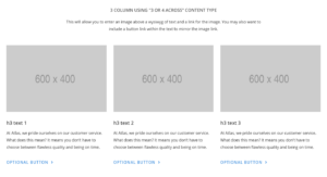
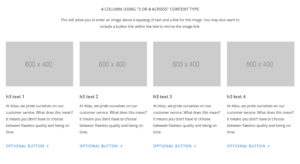
- For 3 and 4 columns use the content type called “3 or 4 Across” for each column. This content type will allow for an image with optional linking and full wysiwyg text for each column.
- Background recommendation for this block is white or grey.
- Use the optional header or intro text wysiwyg for content that will appear centered above the columns.
- Enter all your Image and option image link.
- Enter wysiwyg content – headers, body text, button, etc. in the Text column. If you linked the image you may also want to include a style button link in the text content.
Testimonial
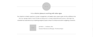
- Background recommendation for this block is white.
- Do NOT use the optional header or intro text wysiwyg.
- Enter your testimonial into the wysiwyg. The optional, larger call out text is an h5. There are no style quote marks in the design, so include them in the content if you like.
- Enter text for First Name, Last Name, Title, Company. Not all of these are required, but you should include at least one attribute for the quote.
- Enter Photo and Logo Images. These are not required but we do recommend them.
Projects
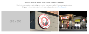
- For the Project block you are ‘joining’ projects post types to display here, so these must be created first in the Projects post type. The Featured Image and the Page Name from the project will feed here.
- Background recommendation for this block is white.
- Do NOT use the optional header or intro text wysiwyg.
- Select as many projects as you’d like to display. These will display 3 across on desktop so multiples of 3 is recommended.
Gallery
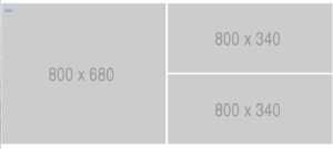
- For the Gallery block you can display any three images. Always, exactly 3 images, sized exactly to the required sizes.
- Background recommendation for this block is white.
- Do NOT use the optional header or intro text wysiwyg.
- Add three ‘rows’ for the images using the red button. The first image will always be the larger left image. Images 2 and 3 are the smaller images that stack.
Counter
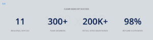

- For the Counter block you can display 2, 3, or 4 stats.
- Select any background option including background image.
- Use the optional header or intro text wysiwyg for content that will appear centered above the projects.
- Use the red “Add Row” button to add a stat area. For each stat enter the Number and Text to display below. Enter a symbol or text needed next to the number (%, +, K, M)